自定义组件和属性
xxxxxxxxxx您可能迫切期望如何知道自定义组件自定义组件的逻辑在:user/ui/..../components目录注意 不同的index-xxx.html 会加载不同位置的组件所有的组件引入入口都在user/ui/..../components/import.js内
一个.vue模块化开发同时又能打包成js集成到magicalcoder的示例
xxxxxxxxxxhttps://gitee.com/magicalcoder/vue-magicalcoder-demo
1 参考示例 mc-button.js
xxxxxxxxxx如下图是一个element-ui按钮组件的简单配置方式:MagicalCoder.install把用户自定义的组件安装到布局器
第一步:新建一个文件 /assets/drag/js/user/ui/element/2.10.1/components/mc-button.js
x/*test组件:MagicalCoder参考lib\mc\magicalcoder.js 闭包的写法有利于内部变量不随意暴漏出去*/(function(){MagicalCoder.install({/*左侧可拖拽的源*/dragItems:[{name:"我的组件",icon:"layui-icon layui-icon-face-smile",children:[{name:"按钮",icon:"ri-checkbox-indeterminate-line",html:"<el-button>确定</el-button>",},]}],/*自定义组件和属性*/components:[{"identifier":"el-button","properties":{"primary":0,"name":"按钮","treeExtraName":{"attr":[],"text":true},"dragInto":false,"duplicate":true,"duplicateAttr":[],"copy":true,"paste":false,"canDelete":true,"dblClickChange":{"type":"text"}},"attributes":[{"title":"属性","active":true,"content":[{"type":"select","clearAttr":true,"oneLine":true,"change":"attr","title":"尺寸","attrName":"size","options":[{"medium":"中等","small":"小","mini":"迷你"}]},{"type":"text","clearAttr":true,"oneLine":true,"change":"text","title":"文本"}]}]}]});})();
第二步: 引入组件到/assets/drag/js/user/ui/element/2.10.1/components/import.js
xMagicalCoder.import(["assets/drag/js/user/ui/element/2.10.1/components/mc-query-table.js","assets/drag/js/user/ui/magicalcoder/components/mc-echarts-line.js","assets/drag/js/user/ui/magicalcoder/components/mc-echarts-bar.js","assets/drag/js/user/ui/magicalcoder/components/mc-echarts-pie.js","assets/drag/js/user/ui/magicalcoder/components/mc-echarts-scatter.js","assets/drag/js/user/ui/element/2.10.1/components/mc-ui-components.js","assets/drag/js/user/ui/element/2.10.1/components/mc-test-tag.js","assets/drag/js/user/ui/magicalcoder/components/mc-geometry.js","assets/drag/js/user/ui/magicalcoder/components/mc-other.js",//引入位置在此处即可"assets/drag/js/user/ui/element/2.10.1/components/mc-button.js",])
第三步:打开布局器最左侧 组件/我的组件/即可找到以上组件
2 配置解析
2.1 第一步 配置dragItems则会自动出现在左侧拖拽区域 icon也可以取样式名称 https://remixicon.com/ 这里开源图标可以直接使用
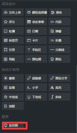
xxxxxxxxxx{name:"图表",children:[{name:"条形图",icon:"assets/drag/img/left/other1.png",html:"<div class='echarts-bar' style='height:400px;'></div>"}]}具体对应关系非常容易看到,主要是html 就是您控件所对应的html icon也可以使用i的样式名
xxxxxxxxxx注意html的内容不要使用缩减方式如:<el-rate/> 而应该是<el-rate></el-rate>
2.2 第二步 配置components-- properties影响控件展现行为等
xidentifier:组件命名空间支持 标签名 样式名 属性名=属性值 三种方式 尽量保证每个组件唯一 这样布局器就可以认识此组件布局器会自动按照 标签名>样式名>属性名=属性值的方式来为您配置的组件取一个全局唯一key 当出现重复的时候 可通过primary:int类型的控制优先级properties:{请参考下表}
x例如:properties: {name:"单选框组",treeExtraName:{attr:["v-model"]},dragInto:true,duplicate:true,assistDuplicate:true,duplicateAttr:[],copy:true,paste:true,canDelete:true,assistDelete:true,onlyChildren:["el-radio"],bind:{"v-model":''},assistAdd:true,addOneItems:[{"":[{html:"<el-radio label='1'>单选项1</el-radio>",focus:false}]}] }
2.3 配置attributes 则控制右侧属性
x{type:this.type.TEXT,clearAttr:true,oneLine:true,change:this.change.TEXT,title:'文本'},
| 属性名 | 可选值 | 注释 |
|---|---|---|
| type | text, textarea, select, checkbox, checkbox, colorpicker, checkbox_array, fileupload, html, slider, | 控件类型 |
| change | attr:修改属性 class:修改class属性 text:修改文本 style:修改style属性 mcstyle:修改mcstyle属性 | 修改控件类型 MCSTYLE:我们扩展了一个新属性,存放当前面板的一些特性,但是跟标签渲染属性完全无关(比如锁定,组合等等特性 主要用于操作布局器时体现) |
| attrName | string | 属性名 |
| oneLine | true,false | 标题和控件是否在一行 |
| options | [n:name(属性名,样式名) t:title(标题 为空字符串则不显示) c:checked时候的值(string,boolean) u:unchecked时候的值(string,boolean) dv:defaultValue如果控件未配置此属性,会以此值来暂时显示默认值] | 可选值 |
| extend | true,false | 是否启用扩展配置 |
| extendKey | "icon" | 打开callback.js 找到extend_config方法阅读一下 |
| lineStyle | "width:40%;display:inline-block;" | 自定义当前行style;如果您要一行多个控件,那这个就很有用 |
| lineClass | "自己的样式" | 追加样式到当前行 |
| hide | false,true | 是否隐藏此行配置 |
| htmlAttrs | [{"属性名":"属性值"}] | html的标准属性 比如您希望只读 [{"readonly":""},{"disabled":"true"}] |
| validate | {"正则表达式":"如果不匹配则弹出提示警告"} | validate:{"^[a-zA-Z][a-zA-Z0-9_]*$":"请输入字母数字或者下划线"} 注意正则写法以^$包裹才能完全匹配 |
| html | ' | 与this.type.HTML配合使用方有效 例如 {type:this.type.HTML,html:' |
| extra | {min:1,max:10} | extra:layui组件对应的控件配置 |
| clearAttr | true,false | 是否显示删除属性按钮 |
| callback | callback:{coverAttrValueToArray:function(attrValue,focusNode){return ['print'];},parseArrayToAttrValue:function(attrValueArr){return JSON.stringify(attrValueArr)}} | 各种回调 下面是2个示例 |
| callback | callback:{coverAttrValueToArray:function(attrValue,focusNode){return ['print'];}} | 当类型是CHECKBOX_ARRAY 回调 请把attrValue转成字符串数组返回 从而实现属性各种多项场景的配置 |
| callback | callback:{parseArrayToAttrValue:function(attrValueArr,focusNode){return JSON.stringify(attrValueArr)}} | 当类型是CHECKBOX_ARRAY 回调 请把字符串数组转成实际的配置返回 从而实现属性各种多项场景的配置 |
| callback | callback:{coverValueToAttr:function(value,focusNode){return "url(""+value+"")"}} | 比如backgroud-image时,我们要给图片添加变成这种格式 url("img.jpg") 就可以使用这个callback实现 |
| callback | callback:{htmlCallback:function(param){return "我自己的结构"},render:function(param){}} | 自定义属性的html,type必须是this.type.HTML,事件如何处理呢?需要写在render回调即可 如果您集成了vue组件在index-xxx.html页面,那么这里写vue组件会十分简单 |
2.4 参考ui/..../components中已经配置的各种场景组件
2.5 MagicalCoder组件的全部配置
x/*test组件:MagicalCoder参考lib\mc\magicalcoder.js 闭包的写法有利于内部变量不随意暴漏出去*/(function(){MagicalCoder.install({/*左侧可拖拽的源*/dragItems:[],/*自定义组件和属性*/components:[{"identifier":"el-button","properties":{},"attributes":[]}],/*布局器所有回调处理*/callbacks:[{/*参考callback.js中的回调函数名:布局器启动后*/after_start:function(param){},/*执行顺序*/order:1},],/*可以在此处理环境变量application-env.js*/changeEnv:function(appEnv){appEnv.env.version="3.1.0"},/*自定义的样式*/styles:[{order:1,css: "body:{width:100px;}"}]});})();原则上 用户自定义的组件在布局器内的属性 样式 行为等 都可以在此文件内完成,无需修改布局器的源码,这点非常有利于用户在后期的升级上,可以自己下载布局器代码后,覆盖文件(忽略imports.js)即可无缝升级。